From Form Factor to First Principles: Leading with UX in Wearable Tech
From Form Factor to First Principles: Leading with UX in Wearable Tech
From Form Factor to First Principles: Leading with UX in Wearable Tech
Post-Launch Product Video. Refresh if not working.
Context
Joining Muse Wearables as their first Lead Product Designer, I walked into a beautiful hybrid smartwatch that was failing in the market. Sales were declining, and user churn was high. By championing user research and a first-principles approach, I led a cross-functional overhaul of the product's physical form, interaction model, and digital experience.
[Type]
Healthcare
[My Role]
Lead Designer
[Timeline]
January 2024- March 2024
[Team]
Founders, CTO, Engineering Team
[Team]
Founders, CTO, Engineering Team
✨ Desktop recommended
This is the mobile-friendly summary—for deeper dive check out the complete case study on desktop!
Your interest means everything—thanks for exploring my work! 🌟"
TL;DR
[The Problem]
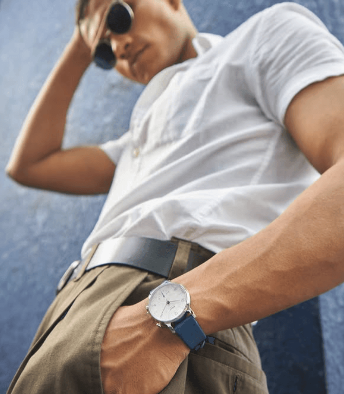
Muse Wearables’ flagship hybrid watch looked great on paper but failed in the real world. Users found it uncomfortable, confusing to use, and lacking in everyday value.
Muse Wearables’ flagship hybrid watch looked great on paper but failed in the real world. Users found it uncomfortable, confusing to use, and lacking in everyday value.
Muse Wearables’ flagship hybrid watch looked great on paper but failed in the real world. Users found it uncomfortable, confusing to use, and lacking in everyday value.
[The Outcome]
I led a user-centered redesign that reimagined the watch’s interaction model, comfort, and visual clarity. Along the way, I rebuilt trust in design as a strategic function, expanded our role in roadmap planning, and eventually overhauled packaging to reflect a more cohesive brand experience.
I led a user-centered redesign that reimagined the watch’s interaction model, comfort, and visual clarity. Along the way, I rebuilt trust in design as a strategic function, expanded our role in roadmap planning, and eventually overhauled packaging to reflect a more cohesive brand experience.
I led a user-centered redesign that reimagined the watch’s interaction model, comfort, and visual clarity. Along the way, I rebuilt trust in design as a strategic function, expanded our role in roadmap planning, and eventually overhauled packaging to reflect a more cohesive brand experience.


[The Impact]
✅ The hybrid watch launched in July 2022 across Amazon and Muse’s own platform.
✅ The hybrid watch launched in July 2022 across Amazon and Muse’s own platform.
✅ The hybrid watch launched in July 2022 across Amazon and Muse’s own platform.
✅ Positive user reviews around comfort, simplicity, and style.
✅ Positive user reviews around comfort, simplicity, and style.
✅ Positive user reviews around comfort, simplicity, and style.
✅ 30% increase in product sales.
✅ 30% increase in product sales.
✅ 30% increase in product sales.
✅ Muse Wearables repositioned as a serious player in the wearables tech space.
✅ Muse Wearables repositioned as a serious player in the wearables tech space.
✅ Muse Wearables repositioned as a serious player in the wearables tech space.
Here's what I walked into
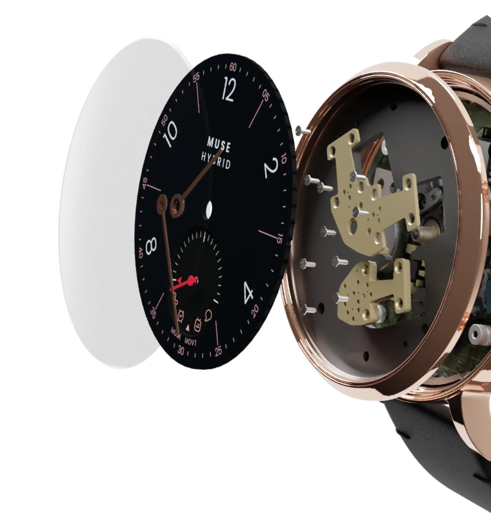
I joined as the first and only designer on a team of engineers. At the time, design was treated as a downstream function—focused on CAD files, mechanical feasibility, and cosmetic tweaks.
There was no design research, no user input, and no clear product vision. Most decisions were made based on assumptions or what competitors were doing, not user needs. The result was a pile of component tests, CAD explorations, and bulky prototypes—none of which addressed usability or long-term engagement.

Prototyping without direction just pushing CAD files
Designing in isolation, without real user context, would result in yet another forgettable watch. So I pushed back, asking critical questions:
Designing in isolation, without real user context, would result in yet another forgettable watch. So I pushed back, asking critical questions:
“Why are users dropping off?”
“Why are users dropping off?”
“Who is this watch really for?”
“Who is this watch really for?”
“What does value look like from a user’s perspective?”
“What does value look like from a user’s perspective?”
These questions led to deeper insights. Through informal interviews, usability reviews, and user feedback, I uncovered recurring pain points:
These questions led to deeper insights. Through informal interviews, usability reviews, and user feedback, I uncovered recurring pain points:
Key Issues Identified
⚠️ The watch was uncomfortable
The watch was heavier than ideal. The strap design lacked flexibility, and the dial size was too large for many wrists—especially women, despite the product being marketed as unisex.
⚠️ The UX was unclear
Smart features were unclear. Sub-dials lacked feedback, notifications were inconsistent, and onboarding was virtually non-existent. The learning curve led to frustration and early abandonment.
The result? A 45% churn rate within six months and growing disengagement from our core demographic—tech-savvy young adults seeking both form and function.
The result? A 45% churn rate within six months and growing disengagement from our core demographic—tech-savvy young adults seeking both form and function.
This friction often caused drop-offs right at first use.
This friction often caused drop-offs right at first use.
Here’s how I rebuilt trust and got results
Instead of jumping into solutions, I first focused on making friction tangible for the team—through sketches, technical breakdowns, and real user evidence.
Instead of jumping into solutions, I first focused on making friction tangible for the team—through sketches, technical breakdowns, and real user evidence.
I began by collecting real user photos and review excerpts. The complaints were consistent:
"The dial size and strap size is too big for my wrist"
"The dial size and strap size is too big for my wrist"

(Reddit r/Smartwatches)
(Reddit r/Smartwatches)
The casing is way too thick. Wearing it all day feels like a weight on my wrist.
"The casing is way too thick. Wearing it all day feels like a weight on my wrist."

(Amazon Review)
(Amazon Review)
"It took me three tries to connect my watch."
"It took me three tries to connect my watch."

— Participant, Setup Usability Study
(Reddit r/Smartwatches)
I documented the specific friction points and design directions through quick observations and usability walkthroughs

Previous Version of the watch and improvements
I began by collecting real user photos and review excerpts. The complaints were consistent:
To bridge the gap between problems and potential, I created rapid but detailed sketches. These weren't polished concepts—they were visual hypotheses showing how form, fit, and interaction could be reimagined for real users.
To bridge the gap between problems and potential, I created rapid but detailed sketches. These weren't polished concepts—they were visual hypotheses showing how form, fit, and interaction could be reimagined for real users.
I documented the specific friction points and design directions through quick observations and usability walkthroughs

Watch Visuals Sketch

Watch Interaction Sketch
By grounding the conversation in user feedback and low-friction visual thinking, I helped the team see the product not as something to tweak—but something to reimagine.
By grounding the conversation in user feedback and low-friction visual thinking, I helped the team see the product not as something to tweak—but something to reimagine.
Focusing from reaction to intention
With alignment building across engineering and leadership, I guided the team toward a research-driven redesign anchored in three principles:
1. Seamless Onboarding & Intuitive Interaction
First I removed unnecessary complexity in the physical interaction and made everyday utility made accessible.

Watch Interaction
The redesign featured a clean, two-button interface mapped to core functions—activity goals, call alerts, and basic notifications. No touchscreen. No overload. Just everyday utility made accessible.
To complete the ecosystem, I then redesigned the onboarding flow for the Muse companion app. The goal was to make setup effortless and intuitive — ensuring first use success and reducing drop-offs.
Human Factors-Informed UX Process:
Identify → Design → Evaluate → Iterate → Validate
Key Improvements:
QR-based pairing instead of manual Bluetooth
QR-based pairing instead of manual Bluetooth
Stepwise visual calibration for dials and sensors
Stepwise visual calibration for dials and sensors
Clear progress indicators and accessible copy
Clear progress indicators and accessible copy
High-contrast design for readability under sunlight
High-contrast design for readability under sunlight

Micro-animations create a sense of continuity and reduce cognitive load — guiding users through calibration naturally
The redesigned onboarding experience shipped as part of Muse’s iOS app. Watch the final flow below.
The redesigned onboarding experience shipped as part of Muse’s iOS app. Watch the final flow below.
Through usability validation, the new onboarding reduced setup time by 40% and increased successful first-time pairing rates from 55% to 88%.”
Through usability validation, the new onboarding reduced setup time by 40% and increased successful first-time pairing rates from 55% to 88%.”

Usability Test Results
2. Comfort and Versatility
Balanced marketing’s push for a slimmer watch with engineering constraints by reshaping the outer profile—adding steeper curves and refining edge thickness. This cross-functional approach improved comfort and made the watch feel sleeker without compromising manufacturability.
This same philosophy of comfort extended digitally — minimizing cognitive load during setup and everyday use.

Cross-functional team alignment
3. Cohesive Visual Language
The cohesive visual language unified physical and digital touchpoints — from the dial interface to the onboarding visuals and packaging. Every element now reinforced the same promise of clarity and simplicity.

Cross-functional team alignment
Cross-functional team alignment
With alignment building across engineering and leadership, I guided the team toward a research-driven redesign anchored in three principles:
Leading Beyond the Product
While product redesign was underway, I flagged the packaging as a huge missed opportunity—
While product redesign was underway, I flagged the packaging as a huge missed opportunity—
It didn’t tell our story, didn’t feel premium, and didn’t reflect the product inside. Initially, I was dismissed. “It’s too expensive to change,” I was told.
It didn’t tell our story, didn’t feel premium, and didn’t reflect the product inside. Initially, I was dismissed. “It’s too expensive to change,” I was told.
Then came the Diwali sale. Sales underperformed. Reviews mentioned weak gifting appeal. Suddenly, packaging mattered. This time, they asked me to lead the redesign.
Then came the Diwali sale. Sales underperformed. Reviews mentioned weak gifting appeal. Suddenly, packaging mattered. This time, they asked me to lead the redesign.
I delivered a more intentional, user-centric packaging system that elevated the unboxing moment without increasing cost. It became one of the most-loved parts of the product
I delivered a more intentional, user-centric packaging system that elevated the unboxing moment without increasing cost. It became one of the most-loved parts of the product

Packaging designed to feel like unboxing a gift
I also created playful illustrations for the website and packaging that showed the watch in everyday moments—subtly reinforcing its adaptability and lifestyle fit.
I also created playful illustrations for the website and packaging that showed the watch in everyday moments—subtly reinforcing its adaptability and lifestyle fit.

Illustrations bringing the watch's adaptability to life.
While product redesign was underway, I flagged the packaging as a huge missed opportunity—
While product redesign was underway, I flagged the packaging as a huge missed opportunity—
It didn’t tell our story, didn’t feel premium, and didn’t reflect the product inside. Initially, I was dismissed. “It’s too expensive to change,” I was told.
It didn’t tell our story, didn’t feel premium, and didn’t reflect the product inside. Initially, I was dismissed. “It’s too expensive to change,” I was told.
Then came the Diwali sale. Sales underperformed. Reviews mentioned weak gifting appeal. Suddenly, packaging mattered. This time, they asked me to lead the redesign.
Then came the Diwali sale. Sales underperformed. Reviews mentioned weak gifting appeal. Suddenly, packaging mattered. This time, they asked me to lead the redesign.
I delivered a more intentional, user-centric packaging system that elevated the unboxing moment without increasing cost. It became one of the most-loved parts of the product
I delivered a more intentional, user-centric packaging system that elevated the unboxing moment without increasing cost. It became one of the most-loved parts of the product
Packaging designed to feel like unboxing a gift
I also created playful illustrations for the website and packaging that showed the watch in everyday moments—subtly reinforcing its adaptability and lifestyle fit.
I also created playful illustrations for the website and packaging that showed the watch in everyday moments—subtly reinforcing its adaptability and lifestyle fit.
Illustrations bringing the watch's adaptability to life.
Here’s what changed after that shift
We hired four more designers to scale the function, and I developed internal design guidelines that streamlined decision-making and reduced execution errors by 40%. Design evolved from an executional role to a strategic partner in the product development process.
We hired four more designers to scale the function, and I developed internal design guidelines that streamlined decision-making and reduced execution errors by 40%. Design evolved from an executional role to a strategic partner in the product development process.
Before I joined
Before I joined
Design wasn’t involved in roadmap planning or product prioritization.
Design wasn’t involved in roadmap planning or product prioritization.
Four months in
Four months in
I was co-leading product research & design, setting priorities based on user needs, not assumptions.
I was co-leading product research & design, setting priorities based on user needs, not assumptions.
Twelve months later
Twelve months later
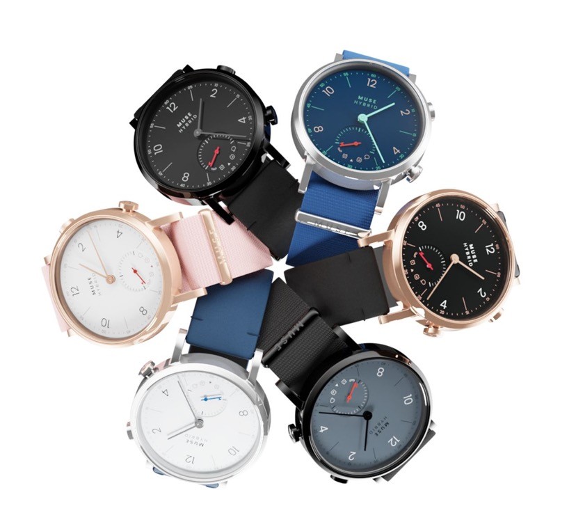
We launched Muse Modernist—in July 2022. A smarter, sleeker, more intentional hybrid watch designed for UX.
We launched Muse Modernist—in July 2022. A smarter, sleeker, more intentional hybrid watch designed for UX.
The impact on business
💬 User Response: Positive reviews surged, especially around comfort, simplicity, and style.
💬 User Response: Positive reviews surged, especially around comfort, simplicity, and style.
📈 Sales Impact: Product sales rose by 30%, exceeding projections.
📈 Sales Impact: Product sales rose by 30%, exceeding projections.
📣 Brand Perception: The product earned renewed attention from investors and media, positioning Muse as a rising player in the wearable space.
📣 Brand Perception: The product earned renewed attention from investors and media, positioning Muse as a rising player in the wearable space.
Here’s how I rebuilt trust and got results
Instead of jumping into solutions, I first focused on making friction tangible for the team—through sketches, technical breakdowns, and real user evidence.
"The dial size and strap size is too big for my wrist"
(Reddit r/Smartwatches)
"The casing is way too thick. Wearing it all day feels like a weight on my wrist."
(Amazon Review)
"No idea what sub-dials track or how to customize them."
(Reddit r/Smartwatches)
Previous Version of the watch and improvements
I began by collecting real user photos and review excerpts. The complaints were consistent:
To bridge the gap between problems and potential, I created rapid but detailed sketches. These weren't polished concepts—they were visual hypotheses showing how form, fit, and interaction could be reimagined for real users.
I documented the specific friction points and design directions through quick observations and usability walkthroughs
Watch Visuals Sketch
Watch Interaction Sketch
By grounding the conversation in user feedback and low-friction visual thinking, I helped the team see the product not as something to tweak—but something to reimagine.
Focusing from reaction to intention
With alignment building across engineering and leadership, I guided the team toward a research-driven redesign anchored in three principles:
1. Intuitive Interaction
Removed unnecessary complexity. The redesign featured a clean, two-button interface mapped to core functions—activity goals, call alerts, and basic notifications. No touchscreen. No overload. Just everyday utility made accessible.
Watch Interaction
2. Comfort and Versatility
Balanced marketing’s push for a slimmer watch with engineering constraints by reshaping the outer profile—adding steeper curves and refining edge thickness. This cross-functional approach improved comfort and made the watch feel sleeker without compromising manufacturability.
Cross-functional team alignment
3. Cohesive Visual Language
The redesigned dial emphasized glanceability: legible icons, high color contrast, and a visual hierarchy that aligned form with function. I worked closely with the brand team to extend this language across the physical product, app interface, and packaging—creating a unified experience.
Cross-functional team alignment
Learnings
I connected user pain points to churn, reframed design as a lever for growth, and earned a seat at the roadmap table by tying UX to revenue and retention.
I connected user pain points to churn, reframed design as a lever for growth, and earned a seat at the roadmap table by tying UX to revenue and retention.
When told “we already know what users want,” I didn’t argue—I showed real data, surfaced user stories, and made friction visible. That’s how I shifted assumptions and earned influence.
When told “we already know what users want,” I didn’t argue—I showed real data, surfaced user stories, and made friction visible. That’s how I shifted assumptions and earned influence.
I walked into a product in decline, uncovered why it was underperforming, and led a research-driven redesign that rebuilt trust internally and externally—proving I can lead through ambiguity.
I walked into a product in decline, uncovered why it was underperforming, and led a research-driven redesign that rebuilt trust internally and externally—proving I can lead through ambiguity.
What the team says about me
“Pooja’s original thinking turned complex challenges into elegant, high-impact solutions.”

Sai Prasanth
CEO, Muse Wearables
“Your contribution is one of the key reasons the product received such strong feedback.”

Ajay Yathindra
Co-Founder & CPO, Muse Wearables
“Pooja is a collaborative, adaptable teammate who brought energy and clarity to every project.”

Isha Desai
Creative Designer, Teammate
Thank you for reading.

[Next Project]
Designing an AI-driven shopping app reducing overwhelm and driving confident purchases
UX Research
Design Thinking
AI-User Experience
View Full Case Study
Here’s what changed after that shift
We hired four more designers to scale the function, and I developed internal design guidelines that streamlined decision-making and reduced execution errors by 40%. Design evolved from an executional role to a strategic partner in the product development process.
Before I joined
Design wasn’t involved in roadmap planning or product prioritization.
Four months in
I was co-leading product research & design, setting priorities based on user needs, not assumptions.
Twelve months later
We launched Muse Modernist—in July 2022. A smarter, sleeker, more intentional hybrid watch designed for UX.
The impact on business
💬 User Response: Positive reviews surged, especially around comfort, simplicity, and style.
📈 Sales Impact: Product sales rose by 30%, exceeding projections.
📣 Brand Perception: The product earned renewed attention from investors and media, positioning Muse as a rising player in the wearable space.
I connected user pain points to churn, reframed design as a lever for growth, and earned a seat at the roadmap table by tying UX to revenue and retention.
When told “we already know what users want,” I didn’t argue—I showed real data, surfaced user stories, and made friction visible. That’s how I shifted assumptions and earned influence.
I walked into a product in decline, uncovered why it was underperforming, and led a research-driven redesign that rebuilt trust internally and externally—proving I can lead through ambiguity.
Learnings
What the team says about me
“Your contribution is one of the key reasons the product received such positive feedback.”

Ajay Yathindra
Co-Founder & CPO, Muse Wearables
“Pooja is a collaborative, adaptable teammate who brought energy and clarity to every project.”

Isha Desai
Creative Designer, Teammate
“Pooja’s original thinking turned complex challenges into elegant, high-impact solutions.”
Sai Prasanth
CEO, Muse Wearables
Leading Beyond the Product
While product redesign was underway, I flagged the packaging as a huge missed opportunity—
It didn’t tell our story, didn’t feel premium, and didn’t reflect the product inside. Initially, I was dismissed. “It’s too expensive to change,” I was told.
Then came the Diwali sale. Sales underperformed. Reviews mentioned weak gifting appeal. Suddenly, packaging mattered. This time, they asked me to lead the redesign.
I delivered a more intentional, user-centric packaging system that elevated the unboxing moment without increasing cost. It became one of the most-loved parts of the product
Packaging designed to feel like unboxing a gift
I also created playful illustrations for the website and packaging that showed the watch in everyday moments—subtly reinforcing its adaptability and lifestyle fit.
Illustrations bringing the watch's adaptability to life.
I joined as the first and only designer on a team of engineers. At the time, design was treated as a downstream function—focused on CAD files, mechanical feasibility, and cosmetic tweaks.
There was no design research, no user input, and no clear product vision. Most decisions were made based on assumptions or what competitors were doing, not user needs. The result was a pile of component tests, CAD explorations, and bulky prototypes—none of which addressed usability or long-term engagement.
Prototyping without direction just pushing CAD files
Designing in isolation, without real user context, would result in yet another forgettable watch. So I pushed back, asking critical questions:
“Why are users dropping off?”
“Who is this watch really for?”
“What does value look like from a user’s perspective?”
These questions led to deeper insights. Through informal interviews, usability reviews, and user feedback, I uncovered recurring pain points:
Key Issues Identified
⚠️ The watch was uncomfortable
The watch was heavier than ideal. The strap design lacked flexibility, and the dial size was too large for many wrists—especially women, despite the product being marketed as unisex.
⚠️ The UX was unclear
Smart features were unclear. Sub-dials lacked feedback, notifications were inconsistent, and onboarding was virtually non-existent. The learning curve led to frustration and early abandonment.