Designing an AI-driven shopping app reducing overwhelm and driving confident purchases
Designing an AI-driven shopping app reducing overwhelm and driving confident purchases
Designing an AI-driven shopping app reducing overwhelm and driving confident purchases

Context
FOMO is an early-stage startup building an AI-powered fashion marketplace, set to launch in mid-2025. When I joined, the founders had strong insights, dozens of feature ideas and a vision that was inspiring but overwhelming. I was brought in to shape this into something usable and focused.
This case study explores how I transformed complexity into an AI-driven shopping app that reduces overwhelm streamlining onboarding, guiding discovery, and enabling confident purchases
This case study explores how I transformed complexity into an AI-driven shopping app that reduces overwhelm streamlining onboarding, guiding discovery, and enabling confident purchases
This case study explores how I transformed complexity into an AI-driven shopping app that reduces overwhelm streamlining onboarding, guiding discovery, and enabling confident purchases
[Type]
Full-time, Early Startup
[My Role]
Lead Product Designer
[Timeline]
12 months
[Team]
Founder, PM, Developers
[Team]
Founder, PM, Developers
TL;DR
The Problem
Most shopping apps flood users with endless options causing frustration, decision fatigue, and drop-off. FOMO was at risk of doing the same, despite having smarter tech.
The Outcome
A lean, human-centered MVP that uses AI to reduce overwhelm, build trust, and make personalized shopping feel intuitive, not transactional.
The Impact
✅ SUS score of 83.5 (excellent usability)
✅ 2× faster product discovery
✅ 60% of users said AI recommendations increased trust
✅ Helped secure pre-seed funding

Navigation: High-Fidelity Prototype
The Impact
✅ SUS score of 83.5 (excellent usability)
✅ 2× faster product discovery
✅ 60% of users said AI recommendations increased trust
✅ Helped secure pre-seed funding
Navigation: High-Fidelity Prototype
The Impact
✅ SUS score of 83.5 (excellent usability)
✅ 2× faster product discovery
✅ 60% of users said AI recommendations increased trust
✅ Helped secure pre-seed funding
Reframing the Vision
Before we built anything, I visualized the founder’s roadmap into a low-fidelity mockup to show how overloaded the experience would feel.
This moment was a turning point it aligned the team around building a confident shopping journey, not just a feature rich platform.
Fig. Visualizing Founder's Vision into a Low-Fid Mockup
My Pivot Pitch
I proposed a reset grounded in user needs:
✅ Mapped real user pain points—showed founders how extra features would worsen decision fatigue.
✅ Proposed a phased approach—start with core issues (personalization + outfit visualization), prove value, then scale.
✅ Co-created a lean roadmap—simplify MVP, measure engagement, then add "delight" features.
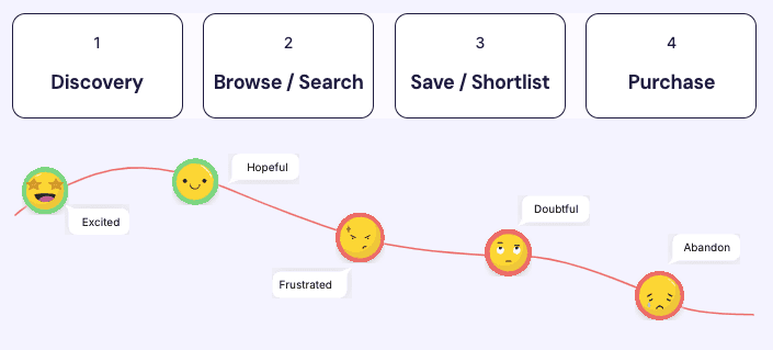
To validate this direction, I conducted discovery research with target audience (ages 18–35) and mapped the emotional arc of their shopping journey—from discovery to purchase.
To validate this direction, I conducted discovery research with target audience (ages 18–35) and mapped the emotional arc of their shopping journey—from discovery to purchase.
JOURNEY STAGES:
1
Discovery
2
Browse / Search
3
Save / Shortlist
4
Purchase
1
Discovery
2
Browse / Search
3
Save / Shortlist
4
Purchase
Excited
Excited
Doubtful
Doubtful
Hopeful
Hopeful
Frustrated
Frustrated
Abandon
Abandon
USER PAINS:
"I save tons of inspiration posts, but can’t find anything similar in my budget on shopping apps."
"I save tons of inspiration posts, but can’t find anything similar in my budget on shopping apps."

Anita (19, Student)
"Even after applying filters, I scroll endlessly through irrelevant options."
"Even after applying filters, I scroll endlessly through irrelevant options."

Alexis (26, Professional)
"I keep second-guessing my wishlist—I’m stuck in analysis paralysis."
"I keep second-guessing my wishlist—I’m stuck in analysis paralysis."

Jenny (32, Business Owner)
Designing for Confidence
Once we had clarity on what not to build, the real work began—designing a product that could guide users without overwhelming them.
Once we had clarity on what not to build, the real work began—designing a product that could guide users without overwhelming them.
I framed the roadmap around one simple idea: give users just enough help to feel confident, without taking away their sense of control.
I framed the roadmap around one simple idea: give users just enough help to feel confident, without taking away their sense of control.
Login /
Signup
Onboarding
questionnaire
Model learns
user preferences
Curated items
displayed
Decision
making help
Checkout
Flow 1 - Onboarding that feels like a stylist, not a survey
We needed user data (body type, skin tone, style) for quality recommendations—but asking too soon would drive drop-off.
What I designed:
Friendly, inclusive tone
Visual, skippable questions
Clear explanations on how responses power personalization
What I designed:
Friendly, inclusive tone
Visual, skippable questions
Clear explanations on how responses power personalization
The entire app’s personalization relied on this moment so building trust from the first tap was everything.
Fig. Screens from Onboarding
Designing for Confidence
Flow 2 - Focused discovery using cognitive restraint
Instead of infinite scroll, I used Miller’s Law to limit screens to 4 curated items at a time prioritizing relevance over volume.
Design Decisions:
No clutter: only in-stock, size-matching items shown
Feedback loop: each swipe trains the AI in real-time
Clear AI reasoning for recommendations (e.g., "because you liked X")
Design Decisions:
No clutter: only in-stock, size-matching items shown
Feedback loop: each swipe trains the AI in real-time
Clear AI reasoning for recommendations (e.g., "because you liked X")
Fig. Screens for Search & Browse
Flow 3 - Outfit Preview to Reduce Second-Guessing
This was where most shoppers got stuck—at the decision point.
To ease that moment, I designed a swipeable outfit preview carousel. Users could see how saved tops and bottoms looked together before committing. No guesswork.
To ease that moment, I designed a swipeable outfit preview carousel. Users could see how saved tops and bottoms looked together before committing. No guesswork.
Each recommendation came with a reason—"Based on your style and recent likes..."—to make the AI feel less random and more like a smart assistant.
And when automation got it wrong? Manual overrides were always one tap away. Because good AI doesn’t just predict—it listens.
Fig. Screens for Wishlist and AI Trust
After shaping the core flows, I tested each touchpoint with real users to ensure it felt intuitive, helpful, and worth coming back to.
After shaping the core flows, I tested each touchpoint with real users to ensure it felt intuitive, helpful, and worth coming back to.
Could a few well-asked questions change how people shop?
Could a few well-asked questions change how people shop?
"I enjoyed answering these questions - it was so hard finding outfits for my body type before. Now I know I won't waste time on irrelevant clutter later."
"I enjoyed answering these questions - it was so hard finding outfits for my body type before. Now I know I won't waste time on irrelevant clutter later."
Anita (19, Student)
Impact:
✅ 2.5× more engagement with image-driven style selections
✅ 2.5× more engagement with image-driven style selections
✅ 1 in 3 skippers returned to complete onboarding later
✅ 1 in 3 skippers returned to complete onboarding later

High-Fidelity Prototype - Onboarding

High-Fidelity Prototype - Browsing
What happens when you stop showing users everything?
What happens when you stop showing users everything?
“This is what I’d normally spend hours saving. But it’s all here—already.”
“This is what I’d normally spend hours saving. But it’s all here—already.”
Alexis (26, Professional)
Impact:
✅ Users found products 2× faster than traditional browsing
✅ Users found products 2× faster than traditional browsing
✅ 60% said AI reasoning helped them avoid impulse purchases
✅ 60% said AI reasoning helped them avoid impulse purchases
The hardest part? Deciding. Did it become easier?
The hardest part? Deciding. Did it become easier?
“The outfit builder fixes everything I struggle with—seeing how it all works together.”
“The outfit builder fixes everything I struggle with—seeing how it all works together.”
Jenny (32, Business Owner)
Impact:
✅ Users were more likely to purchase full looks when they could preview outfits
✅ Users were more likely to purchase full looks when they could preview outfits
✅ SUS score: 83.5 — excellent usability
✅ SUS score: 83.5 — excellent usability

High-Fidelity Prototype - Shortlisting + Purchase
Finally, I shipped a cohesive MVP that scales with user needs
I balanced speed and structure—designing 200+ screens and micro-interactions with an emphasis on rapid validation and ethical AI considerations.
I maintained a clean, vibrant visual language—soft pastels with black accents—to reduce visual noise and draw focus to product imagery.
I maintained a clean, vibrant visual language—soft pastels with black accents—to reduce visual noise and draw focus to product imagery.
I used token-based components and an adapted design system to accelerate iteration while ensuring consistency
Cross-functional alignment:
✅ Weekly syncs with PM, engineers, and the founder kept design aligned with tech constraints and product vision
✅ Detailed annotations for complex interactions (e.g., "swipe-to-train") to bridge design-dev gaps
✅ Built modular foundations—scalable patterns that could evolve beyond the MVP without redesign
Once we had clarity on what not to build, the real work began—designing a product that could guide users without overwhelming them.
I framed the roadmap around one simple idea: give users just enough help to feel confident, without taking away their sense of control.
Login /
Signup
Onboarding
questionnaire
Model learns
user preferences
Curated items
displayed
Decision
making help
Checkout
Flow 1 - Onboarding that feels like a stylist, not a survey
We needed user data (body type, skin tone, style) for quality recommendations but asking too soon would drive drop-off.
What I designed:
Friendly, inclusive tone
Visual, skippable questions
Clear explanations on how responses power personalization
The entire app’s personalization relied on this moment so building trust from the first tap was everything.
Fig. Screens from Onboarding
Flow 2 - Focused discovery using cognitive restraint
Instead of infinite scroll, I used Miller’s Law to limit screens to 4 curated items at a time prioritizing relevance over volume.
Design Decisions:
No clutter: only in-stock, size-matching items shown
Feedback loop: each swipe trains the AI in real-time
Clear AI reasoning for recommendations (e.g., "because you liked X")
Fig. Screens for Search & Browse
Flow 3 - Outfit Preview to Reduce Second-Guessing
This was where most shoppers got stuck—at the decision point.
To ease that moment, I designed a swipeable outfit preview carousel. Users could see how saved tops and bottoms looked together before committing. No guesswork.
Each recommendation came with a reason—"Based on your style and recent likes..."—to make the AI feel less random and more like a smart assistant.
And when automation got it wrong? Manual overrides were always one tap away. Because good AI doesn’t just predict—it listens.
Fig. Screens for Wishlist and AI Trust
After shaping the core flows, I tested each touchpoint with real users to ensure it felt intuitive, helpful, and worth coming back to.
Could a few well-asked questions change how people shop?
"I enjoyed answering these questions - it was so hard finding outfits for my body type before. Now I know I won't waste time on irrelevant clutter later."
Anita (19, Student)
Impact:
✅ 2.5× more engagement with image-driven style selections
✅ 1 in 3 skippers returned to complete onboarding later
High-Fidelity Prototype - Onboarding
What happens when you stop showing users everything?
“This is what I’d normally spend hours saving. But it’s all here—already.”
Alexis (26, Professional)
Impact:
✅ Users found products 2× faster than traditional browsing
✅ 60% said AI reasoning helped them avoid impulse purchases
High-Fidelity Prototype - Browsing
The hardest part? Deciding. Did it become easier?
“The outfit builder fixes everything I struggle with—seeing how it all works together.”
Jenny (32, Business Owner)
Impact:
✅ Users were more likely to purchase full looks when they could preview outfits
✅ SUS score: 83.5 — excellent usability
High-Fidelity Prototype - Shortlisting + Purchase
Finally, I shipped a cohesive MVP that scales with user needs
I balanced speed and structure—designing 200+ screens and micro-interactions with an emphasis on rapid validation and ethical AI considerations.
I maintained a clean, vibrant visual language—soft pastels with black accents—to reduce visual noise and draw focus to product imagery.
I used token-based components and an adapted design system to accelerate iteration while ensuring consistency
Cross-functional alignment:
✅ Weekly syncs with PM, engineers, and the founder kept design aligned with tech constraints and product vision
✅ Detailed annotations for complex interactions (e.g., "swipe-to-train") to bridge design-dev gaps
✅ Built modular foundations—scalable patterns that could evolve beyond the MVP without redesign
Key Learnings
Designing AI with transparency builds trust
Designing AI with transparency builds trust
Users don’t just want smart AI, they want understandable AI. Transparency builds confidence.
MVP ≠ Minimal Design — it’s Focused Design
MVP ≠ Minimal Design — it’s Focused Design
By focusing on decision support, not automation, we shipped faster and more meaningfully.
Human-centered AI means designing for decision support, not automation
Human-centered AI means designing for decision support, not automation
Rather than aiming to replace user effort, I focused on supporting key decision points through curated options, visual outfit builders, and override flexibility. Good AI design empowers, not overwhelms.
Thank you for reading.

[Next Project]
Designing a fraud detection dashboard to boost manager oversight and analyst productivity
Data Visualisation
Gamification
Interaction Design
View Full Case Study
Key Learnings
Designing AI with transparency builds trust
Users don’t just want smart AI, they want understandable AI. Transparency builds confidence.
MVP ≠ Minimal Design — it’s Focused Design
By focusing on decision support, not automation, we shipped faster and more meaningfully.
Human-centered AI means designing for decision support, not automation
Rather than aiming to replace user effort, I focused on supporting key decision points—through curated options, visual outfit builders, and override flexibility. Good AI design empowers, not overwhelms.
Anita (19)
Student in Big City
"I save so many inspiration posts that match my style on Insta and Pinterest but I rarely find the exact ones in my budget on my usual shopping apps.”
Saves 15+ inspo posts on social media weekly, but only converts 2-3 to purchases / month.
Alexis (26)
Working Professional
"I spend hours searching for trendy outfits—filtering by size, my style, reviews. But even then, I’m scrolling for hours through 1000s of irrelevant options."
Avg. 2 hours spent per session, 68% sessions end without purchase.
Jenny (32)
Business Owner
"My wishlist is full, but I can’t decide how to make sure it's versatile. I’m stuck in analysis paralysis—scrolling, comparing, second-guessing."
80% users abandon saved items because of decision fatigue.
JOURNEY STAGES:
USER PAINS:
"I save tons of inspiration posts, but can’t find anything similar in my budget on shopping apps."
Anita (19, Student)
"Even after applying filters, I scroll endlessly through irrelevant options."
Alexis (26, Professional)
"I keep second-guessing my wishlist—I’m stuck in analysis paralysis."
Jenny (32, Business Owner)
Key Insight: Shoppers wanted personalization and efficiency—not more options.
Reframing the Vision
Before we built anything, I visualized the founder’s roadmap into a low-fidelity mockup to show how overloaded the experience would feel
This moment was a turning point it aligned the team around building a confident shopping journey, not just a feature rich platform.
Fig. Visualizing Founder's Vision into a Low-Fid Mockup
[Next Project]
Designing a fraud detection dashboard to boost manager oversight and analyst productivity
Data Visualisation
Gamification
Interaction Design
View Full Case Study