Transformed an internal fraud tool into a strategic dashboard using gamification and data storytelling
Transformed an internal fraud tool into a strategic dashboard using gamification and data storytelling
Transformed an internal fraud tool into a strategic dashboard using gamification and data storytelling


On Track
On Track
On Track
On Track
On Track
On Track
TL;DR

In a hybrid collaboration between SJSU and Phoenix, a credit card fraud detection company, I designed their internal fraud dashboard using real transaction data and direct team feedback. This meant designing for real operational complexity—for two sides: the manager overwhelmed by noise, and the analyst quietly burning out.
It also gave me space to explore two often overlooked design muscles:
Information design for highstakes ops & motivation systems inside internal tools.
[Type]
Industry
[My Role]
Lead Designer
[Timeline]
January 2024- March 2024
[Team]
Co-designer, Project Advisor
[Team]
Co-designer, Project Advisor
The Problem
Analysts were stuck in high-volume case reviews with zero feedback. Managers had no visibility into team performance or fraud trends—leading to inefficiencies, burnout, and inconsistent fraud resolution.
The Outcome
A manager dashboard that improved operational efficiency, boosted team morale, and turned passive data into strategic action.
The Outcome
✅ Cut fraud resolution time by 50%
✅ Increased analyst engagement by 2.4× (self-reported)
✅ Improved decision-making speed (↓ from 5.2 to 2.6 mins per task)
✅ Boosted case throughput by 20% without loss in accuracy
In a hybrid collaboration between SJSU and Phoenix, a credit card fraud detection company, I designed their internal fraud dashboard using real transaction data and direct team feedback. This meant designing for real operational complexity—for two sides: the manager overwhelmed by noise, and the analyst quietly burning out.
It also gave me space to explore two often overlooked design muscles:
Information design for highstakes ops & motivation systems inside internal tools.
Here's what I entered into
Fraud managers were working across disconnected tools, drowning in rows of Excel data just to track who was doing what, how the detection model was performing, and where fraud was growing.


Fig. Managing Fraud through Excels
There were two kinds of users:
There were two kinds of users:
⚠️ Drowning in alerts but missing the big picture
"How do I lead my team effectively without clear insights?"
"How do I lead my team effectively without clear insights?"
Jessica (Fraud Ops Manager)
⚠️ Solving endless cases all day.
"How do I stay motivated and grow when my work feels so monotonous?"
"How do I stay motivated and grow when my work feels so monotonous?"
Mark (Investigation Analyst)
The system flagged anomalies but didn’t help anyone understand or improve. It meant we had to rebuild the workflow—starting from how each role experienced the problem.
One System, Two Interfaces, One Cohesive Experience
I partnered with another designer to divide and conquer: He focused on the analyst interface, and I owned the manager dashboard. We worked closely to ensure both sides felt connected—same UI, patterns, shared language and mutual feedback.
My focus: Jessica.
She needed clarity, oversight, and tools to lead her team.
She needed clarity, oversight, and tools to lead her team.
Fraud Detection Manager
Fraud Detection Manager
Oversee
Oversee
Queue Progress
Queue Progress
Analyst’s Productivity
Analyst’s Productivity
Model Performance
Model Performance
Take Actions
Take Actions
Assign Analyst
Assign Analyst
Monitor Model Performance
Monitor Model Performance
Communicate With Team
Communicate With Team
So I broke her needs into 3 actionable themes:
1. See the Big Picture
Let her track queues, analysts, and model performance at a glance
2. Make Informed Decisions
Surface meaningful insights: trends, anomalies, velocity, performance comparisons
3. Take Essential Actions
Reassign cases, communicate goals, adjust model thresholds in real time
See the Big Picture
See the Big Picture
Overview Dashboard
Overview Dashboard
Queue
Queue
Analyst
Analyst
Analyst
Analyst
Model
Model
Alerts
Alerts
Make Informed Decisions
Make Informed Decisions
00
00
02
02
06
06
04
04
TRENDS
TRENDS
Threshhold
Threshhold
Prediction
Prediction
Cases / hr
Cases / hr
168
168
Mins / case
Mins / case
25m
25m
Take Essential Actions
Take Essential Actions
Export
Export
Assign
Assign
Overview Dashboard
Overview Dashboard
Queue
Queue
Alerts
Alerts
Model
Model
Analyst
Analyst
Action
Action
Assign
Assign
This informed the core Information Architectures
Overview → Queues → Analysts → Models and then drill down into each.
Overview → Queues → Analysts → Models and then drill down into each.
To visualize this, I explored 3 layout directions:
Idea 1 — Card-based with clear reading order (chosen for clarity and scan-ability)
Idea 2 — Case-first layout (too analyst-focused for manager needs)
Idea 3 — Nav-heavy layout (clean, but introduced scroll fatigue)
I chose Idea 1 — it matched how Jessica worked: top-down, pattern-first, drill later.
Search
Search
Model
Model
Queue
Queue
Analyst
Analyst
Alerts
Alerts
Overview
Overview
Queue
Queue
5 Oct 2024
5 Oct 2024
Refresh
Refresh
Analyst
Analyst
Model
Model
Assign
Assign
Export
Export
PHNX
PHNX
Global
Objects
Global
Objects
Global Time
Controls
Global Time
Controls
Global CTA
Global CTA
Global Controls
Global Controls
Objects, Attributes
& analytics
Objects, Attributes
& analytics
Idea 1
Idea 1
Search
Search
Model
Model
Queue
Queue
Analyst
Analyst
Analyst
Analyst
Overview
Overview
Queue
Queue
5 Oct 2024
5 Oct 2024
Refresh
Refresh
Analyst
Analyst
Model
Model
Assign
Assign
Export
Export
PHNX
PHNX
Cases
Cases
Idea 2
Idea 2
Search
Search
Queue
Queue
Model
Model
Analyst
Analyst
Overview
Overview
Queue
Queue
5 Oct 2024
5 Oct 2024
Refresh
Refresh
Analyst
Analyst
Model
Model
Assign
Assign
Export
Export
PHNX
PHNX
Idea 3
Idea 3
Fig. Layout Ideation Sketches
Challenge 1/2
Visualizing Data That Demanded Action
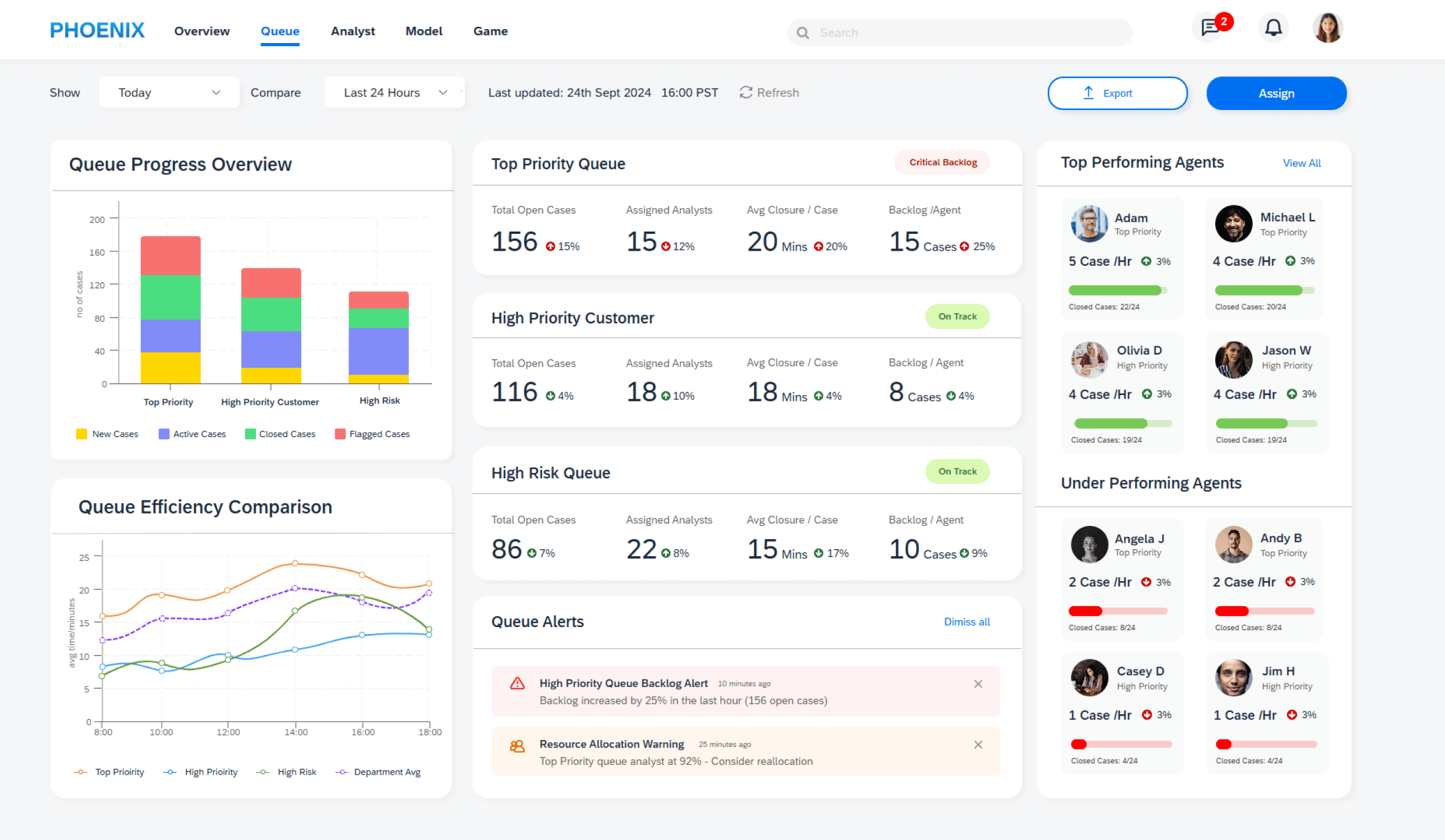
Using data from real transaction logs, I built visualizations that let Jessica:
Using data from real transaction logs, I built visualizations that let Jessica:
✔ Compare fraud trends over time
✔ Spot when model performance dipped
✔ Drill down into specific analysts or queues or models
✔ Get alerted when KPIs crossed thresholds
I brought Idea 1 to life in a clickable prototype—with every screen built to reduce friction and surface blind spots.
I brought Idea 1 to life in a clickable prototype—with every screen built to reduce friction and surface blind spots.
Swipe left to see the screens →

colour coded alerts for quick action
quick alerts
thresholds for quick scan
communicate faster with team
manager profile
Manager Overview
Take Actions
analyst overview
queue progress
overview


help in making informed decisions

Queue Detail
Queue Drill Down
Sorting and filtering data
speed focused and not quality driven
normalised data
colour coded
categorisation
performance
trends


Model Detail
Model Drill Down
model comparison & performance over time
comparison of case progress
drill down to specific model
case
attributes
colour coded alerts for quick action
quick alerts
thresholds for quick scan
communicate faster with team
manager profile
Manager Overview
Take Actions
analyst overview
queue progress
overview
help in making informed decisions
Queue Detail
Queue Drill Down
Sorting and filtering data
speed focused and not quality driven
normalised data
colour coded
categorisation
performance
trends
Model Detail
Model Drill Down
model comparison & performance over time
comparison of case progress
drill down to specific model
case
attributes
Then I ran a usability test
Then I ran a usability test
Tested with 4 managers and 4 analysts using prototype v01
✅ 100% of managers reported better oversight
✅ Decision-making got faster, with less cognitive strain
🗣️ “I’d save 2 hours a week—just on tracking and reassigning.”
So far, so good. But something unexpected surfaced—one this dashboard alone couldn’t fix.
So far, so good. But something unexpected surfaced—one this dashboard alone couldn’t fix.
Challenge 2/2
Solving the Engagement & Motivation Problem
Jessica finally had visibility. But now her team’s low engagement was more obvious. They said -
Jessica finally had visibility. But now her team’s low engagement was more obvious. They said -
“I don’t know how to keep them motivated.”
Jessica
Fraud Ops Manager
“100 cases a day, no feedback. It just feels… pointless.”
Mark
Investigation Analyst
That’s when I pitched something unconventional: gamification. The goal was simple.
💡 Keep analysts engaged through progression, recognition, and competition
💡 Break monotony with real-time XP, badges, and team rankings
💡 Give managers tools to reward efficiency and engagement.
I designed a game layer woven directly into the workflow.
Analysts earned XP and coins for resolving cases accurately, mentoring peers, and handling complex queues.
Managers could set strategic objectives, allocate real-world rewards, and track ROI based on outcomes like queue reduction or model accuracy.
Solve fraud
cases
Solve fraud
cases
Earn XP
& Coins
Earn XP
& Coins
Level
up
Level
up
Unlock
harder
cases
Unlock
harder
cases
Win Rewards &
Recognition
Win Rewards &
Recognition
Manager Journey
(Jessica)
Manager Journey
(Jessica)
Track
KPIs
Track
KPIs
Set game
objectives
Set game
objectives
Launch
Game
Launch
Game
Adjust
strategy
Adjust
strategy
Recognize & reward winners
Recognize & reward winners
Then created these building blocks for the manager to control the game.
Refer to the image below.

Fig. Game Design Building Blocks
Redesigned the screens adding a gamification layer
Please give it a moment to load

GIF: Final prototype.
And it worked. I ran another usability test.
Re-tested with the same group after integrating gamification
“Watching my level go up makes repetitive work feel meaningful.”
“Watching my level go up makes repetitive work feel meaningful.”

Mike, Analyst
“The leaderboard would change how I manage my team’s development.”
“The leaderboard would change how I manage my team’s development.”

Casey, Manager
“This helps me justify budget in ways that actually reduce fraud.”
“This helps me justify budget in ways that actually reduce fraud.”

Sarah, Manager
✅ 3 out of 4 managers preferred the game-enabled dashboard
✅ Analysts resolved 20% more cases on average
Key Learnings
1️⃣ Designing for internal tools means thinking beyond function. Clarity, motivation, and visibility matter just as much as usability.
2️⃣ Systems thinking helped me turn messy data into meaningful actions by connecting user needs with real-time decisions.
3️⃣. Engagement matters. Adding small feedback loops and recognition made routine work feel more meaningful for the team.
If I did it again…
I’d rethink how we visualize progression, not just tasks, but growth and quality over time, while also being more intentional about which metrics to surface, balancing motivation without creating pressure.
Thank you for reading.

[Next Project]
Designed dog park experience through trust-based profiles, real-time check-ins, and local community features.
Design trade-offs
Deep-dive for 1 feature
Experimentation & Testing
View Full Case Study
So I broke her needs into 3 actionable themes:
1. See the Big Picture
Let her track queues, analysts, and model performance at a glance
2. Make Informed Decisions
Surface meaningful insights: trends, anomalies, velocity, performance comparisons
3. Take Essential Actions
Reassign cases, communicate goals, adjust model thresholds in real time
See the Big Picture
Overview Dashboard
Queue
Analyst
Analyst
Model
Alerts
Make Informed Decisions
00
02
06
04
TRENDS
Threshhold
Prediction
Cases / hr
168
Mins / case
25m
Take Essential Actions
Export
Assign
Overview Dashboard
Queue
Alerts
Model
Analyst
Action
Assign
This informed the core Information Architectures
Overview → Queues → Analysts → Models and then drill down into each.
To visualize this, I explored 3 layout directions:
Idea 1 — Card-based with clear reading order (chosen for clarity and scan-ability)
Idea 2 — Case-first layout (too analyst-focused for manager needs)
Idea 3 — Nav-heavy layout (clean, but introduced scroll fatigue)
I chose Idea 1 — it matched how Jessica worked: top-down, pattern-first, drill later.
Search
Model
Queue
Analyst
Alerts
Overview
Queue
5 Oct 2024
Refresh
Analyst
Model
Assign
Export
PHNX
Global
Objects
Global Time
Controls
Global CTA
Global Controls
Objects, Attributes
& analytics
Idea 1
Search
Model
Queue
Analyst
Analyst
Overview
Queue
5 Oct 2024
Refresh
Analyst
Model
Assign
Export
PHNX
Cases
Idea 2
Search
Queue
Model
Analyst
Overview
Queue
5 Oct 2024
Refresh
Analyst
Model
Assign
Export
PHNX
Idea 3
Fig. Layout Ideation Sketches
Challenge 1/2
Visualizing Data That Demanded Action
Using data from real transaction logs, I built visualizations that let Jessica:
✔ Compare fraud trends over time
✔ Spot when model performance dipped
✔ Drill down into specific analysts or queues or models
✔ Get alerted when KPIs crossed thresholds
I brought Idea 1 to life in a clickable prototype—with every screen built to reduce friction and surface blind spots.
Swipe left to see the screens →


Tested with 4 managers and 4 analysts using prototype v01
What Worked
✅ 100% of managers reported better oversight
✅ Decision-making got faster, with less cognitive strain
🗣️ “I’d save 2 hours a week—just on tracking and reassigning.”
So far, so good. But something unexpected surfaced—one this dashboard alone couldn’t fix.
What Worked
Challenge 2/2
Solving the Engagement & Motivation Problem
Jessica finally had visibility. But now her team’s low engagement was more obvious. They said -
“I don’t know how to keep them motivated.”
Jessica
Fraud Ops Manager
“100 cases a day, no feedback. It just feels… pointless.”
Mark
Investigation Analyst
That’s when I pitched something unconventional: gamification. The goal was simple.
💡 Keep analysts engaged through progression, recognition, and competition
💡 Break monotony with real-time XP, badges, and team rankings
💡 Give managers tools to reward efficiency and engagement.
I designed a game layer woven directly into the workflow.
Analysts earned XP and coins for resolving cases accurately, mentoring peers, and handling complex queues.
Managers could set strategic objectives, allocate real-world rewards, and track ROI based on outcomes like queue reduction or model accuracy.
Then created these building blocks for the manager to control the game.
Refer to the image below.
Fig. Game Design Building Blocks
Redesigned the screens adding a gamification layer
Please give it a moment to load
GIF: Final prototype.
And it worked. I ran another usability test.
Re-tested with the same group after integrating gamification
✅ 3 out of 4 managers preferred the game-enabled dashboard
✅ Analysts resolved 20% more cases on average
“Watching my level go up makes repetitive work feel meaningful.” - Analyst
“The leaderboard would change how I manage my team’s development.”
“This helps me justify budget in ways that actually reduce fraud.”
Learnings
If I did it again…
I’d rethink how we visualize progression, not just tasks, but growth and quality over time, while also being more intentional about which metrics to surface, balancing motivation without creating pressure.
1️⃣ Designing for internal tools means thinking beyond function. Clarity, motivation, and visibility matter just as much as usability.
2️⃣ Systems thinking helped me turn messy data into meaningful actions by connecting user needs with real-time decisions.
3️⃣. Engagement matters. Adding small feedback loops and recognition made routine work feel more meaningful for the team.
✨ Desktop recommended
This is the mobile-friendly summary—for deeper dive check out the complete case study on desktop!
Your interest means everything—thanks for exploring my work! 🌟"
Here's what I entered into
Fraud managers were working across disconnected tools, drowning in rows of Excel data just to track who was doing what, how the detection model was performing, and where fraud was growing.
Fig. Managing Fraud through Excels
There were two kinds of users:
⚠️ Solving endless cases all day.
"How do I stay motivated and grow when my work feels so monotonous?"
Mark (Investigation Analyst)
⚠️ Drowning in alerts but missing the big picture
"How do I lead my team effectively without clear insights?"
Jessica (Fraud Ops Manager)
⚠️ Solving endless cases all day.
"How do I stay motivated and grow when my work feels so monotonous?"
Mark (Investigation Analyst)
The system flagged anomalies but didn’t help anyone understand or improve. It meant we had to rebuild the workflow—starting from how each role experienced the problem.
[Next Project]
Designed dog park experience through trust-based profiles, real-time check-ins, and local community features.
Design trade-offs
Deep-dive for 1 feature
Experimentation & Testing
View Full Case Study